Marcus Performing Arts Center
The Marcus Performing Arts Center in Milwaukee has been a thriving home for arts, education and community engagement since 1969.
But with so much growth over the past few years, MPAC’s website had grown to over 300 pages and become exceptionally hard to navigate.
This was frustrating to the team at MPAC, as they needed their online experience to match up with the world-class experiences happening behind their doors.
The Problems
MPAC’S website problems included:
Lack of organization
Cluttered homepage
Confusing navigation
Poor mobile optimization
Events going unnoticed
Outdated technology
I was brought into the project as Lead Copywriter by Dana Casto (Whispr Strategic), and collaborated closely with designer Sarah Hackman (Hackman Creative) and developer Brian Deer (Brian Deer Digital).
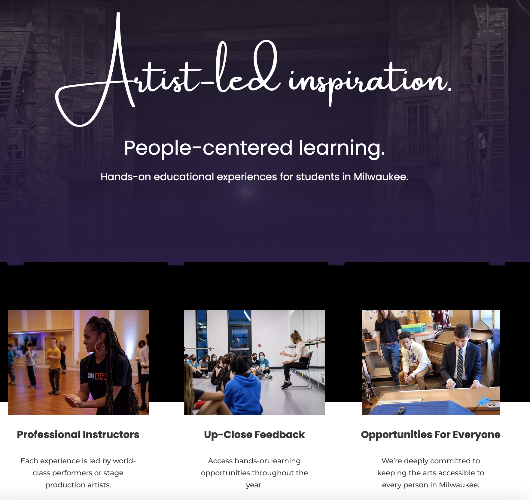
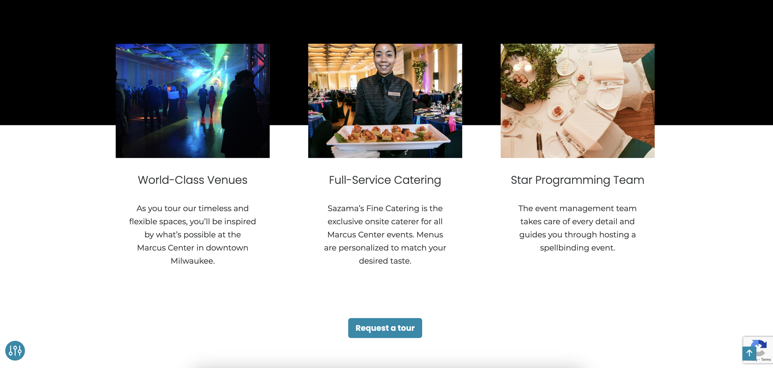
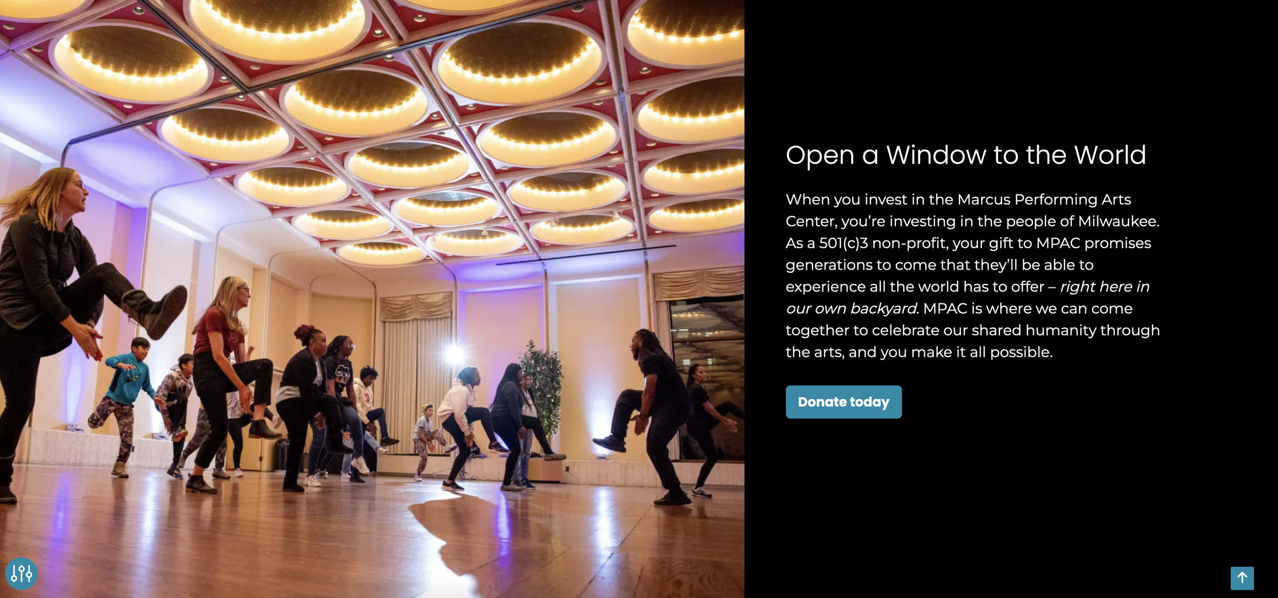
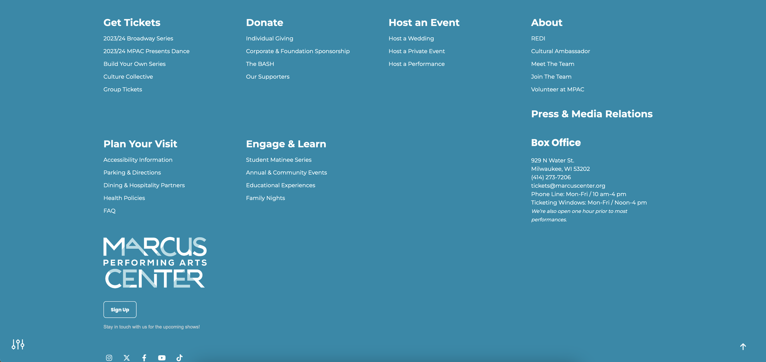
Together, we built a brand new website that slimmed their 300+ page behemoth into 54 clear, user-friendly pages inside a navigation structure that made it easy for any visitor to find exactly what they’re looking for - fast.
The solution
The new site included:
Streamlined Homepage
User-friendly navigation
Mobile-first approach
Simple purchase paths
Prominent departmental initiatives
Better technology
Strategic business model representation
Audience personas
Brand archetype strategy
MPAC's website redesign wasn't just about aesthetics.
More importantly, we helped them create a user-first experience that will breathe new life into each of their revenue streams, while making it easier than ever for patrons both new and old to see what Marcus Performing Arts Center has for them.
Within the first 6 months of the new site launching:
Bounce rate decreased by 204%
Returning visitors increased by 310%
Average time on page increased by 133%
The number of interactions on the site went from 540,000 to 2,140,910: an increase of 292%


